Mapping Chemical Space with UMAP
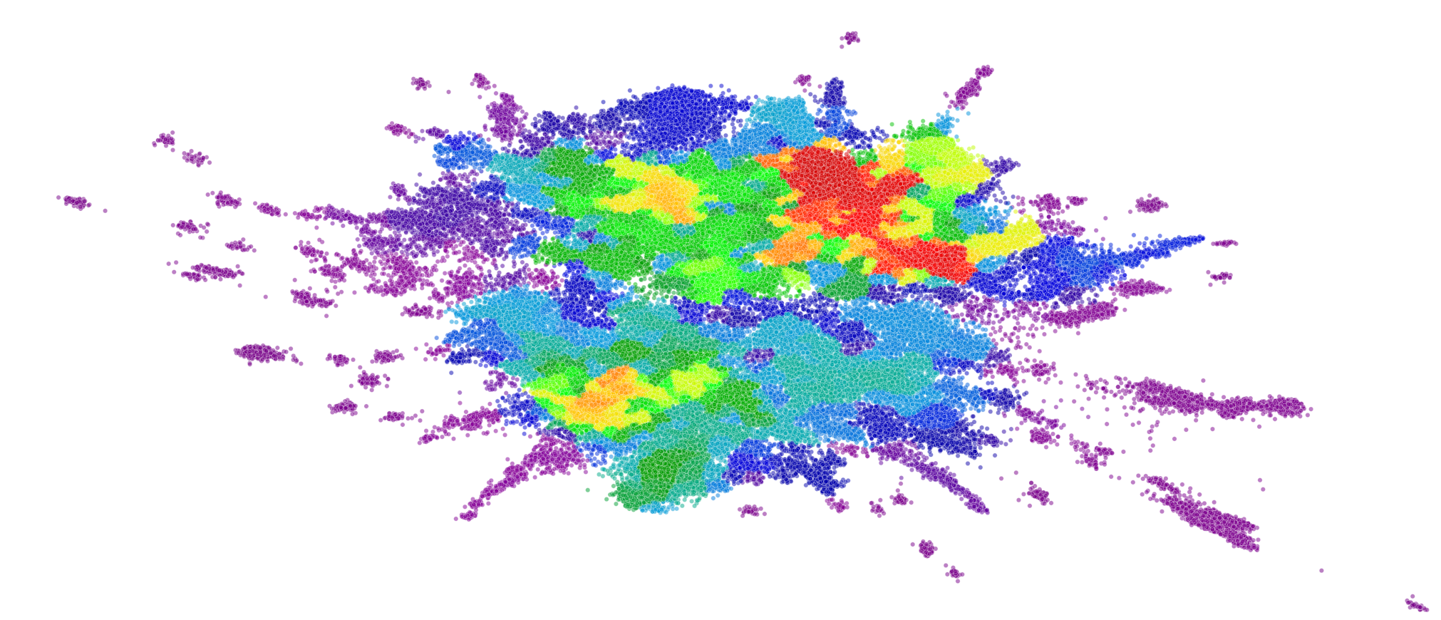
Note: this was originally written for the Reverie Labs blog which got taken down after acquisition so now it’s re-posted here
This blog post discusses why it is important to visualize the latent space of chemical datasets, what makes UMAP a useful tool for this purpose, and how we use UMAP at Reverie Labs. As an example, we use the Blood Brain Barrier Permeability (BBBP) dataset from MoleculeNet for our visualizations and the code tutorial. This dataset has measurements from over 2000 unique compounds, many of which are approved drugs, each labeled as “permeable” or “not permeable”. We look into the details of how this dataset gets embedded by various dimensionality reduction methods and reveal some fascinating properties of UMAP.
For a walkthrough using this dataset of how to use UMAP to visualize chemical space, see this Colab notebook:
Motivation
A fundamental assumption behind most machine learning methods is that data are independent and identically distributed (IID). However, in drug discovery datasets, compounds are almost never sampled independently, as they are typically extracted from experiments for specific therapeutic programs. Measurements often follow the patterns of the drug development efforts that generate them. Any biases in the data-generation process can also sneak into the training and evaluation of models. In practice, this means that open source and industry datasets are often “clumpy”, consisting of measurements for compounds that are very similar to one another and non-uniformly cover chemical space. Visualizing the chemical space of a dataset does not solve these issues, but it helps us better understand them within the context of our datasets.
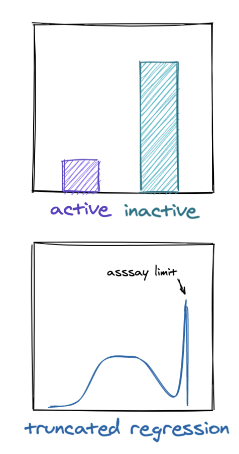
At Reverie Labs, we work with dozens of datasets spanning a range of different properties. When ingesting a new dataset, we begin with a systematized analysis that identifies biases and helps determine how best to prepare and use the dataset for modeling. As with most machine learning problems, we want to understand the distribution of the measured property we are modeling (What is the class balance within a classification dataset? Does our regression dataset have truncated measurements due to assay limits? etc.) We want to make sure the measurements look reasonable and compare their distributions in our training and test data. However, we cannot stop there. We must also look at the distribution of the chemical structures that the measurements are taken from because the compounds themselves are typically selected from a biased generation process.
Visualizing the distribution of our compounds in chemical space allows us to gauge how much we expect models trained on a given dataset to generalize to new chemical matter. These visualizations can help with manual inspection of Structure-Activity / Structure-Property Relationships (SAR/SPR), expose potential quirks or biases in the dataset, and reveal insights for how we might want to split the dataset into training and evaluation sets. These are many methods we can use for visualizing chemical space, but at Reverie, we have selected a default procedure involving UMAP that optimizes accuracy, speed, and ease-of-use.
Embeddings
That sounds great, but how do we actually visualize these distributions? The key here is that we need to embed our compounds into a low-dimensional vector form that can be easily interpreted (in this post we stick to 2D for simplicity’s sake but 3D would also work). Representing our molecules as 2048-bit Extended-Connectivity Fingerprints (ECFPs) gives us high dimensional vectors that we can then project into a 2-dimensional space for visualization. PCA and t-SNE are commonly used for this kind of dimensionality reduction, and have been used for many biology and chemistry purposes. Since usage of these tools has been thoroughly documented, here we focus on the utility of a more recent addition to the dimensionality reduction repertoire: UMAP.
Uniform Manifold Approximation and Projection (UMAP) constructs a high-dimensional graph representation of the entire dataset then tries to re-create a low dimensional version of this initial graph that maintains as much of the local and global structure as possible. This method is somewhat similar to t-SNE, but with a few key differences that lead to important advantages for our purposes. The technical differences between UMAP and t-SNE would take up a full blog post, so we will not detail them here but more details can be found in these resources: the original paper, Understanding UMAP or How Exactly UMAP Works.
The most relevant benefits UMAP provides us are speed, the ability to maintain some of the local / global structure of the data, and an easy interface for applying an embedding from one dataset to a different dataset.
Speed
To evaluate the speed of these methods, we compute ECFPs of various sizes and embed each using each PCA, t-SNE, and UMAP:
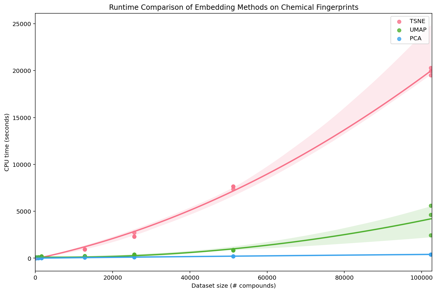
We can see that PCA is the most efficient, UMAP is slightly less efficient, and t-SNE is by far the least efficient. For small datasets, these time differences are not particularly relevant, but they really add up as the number of compounds grows. To be fair, we used the most generic implementations (PCA and t-SNE from sklearn) and there are more efficient variants of t-SNE. However, the UMAP Docs contain a similar performance analysis on MNIST, including a wider variety of the performant methods, and find similar results.
Additionally, the creators of UMAP recently released a new version of the algorithm, ParametricUMAP, that uses a neural network to reduce the dimensions of the graphical embedding, giving it even greater speed improvements. For this post we stick to the original, non-parametric UMAP, but if you want to optimize the speed of embedding new compounds into a pre-fit UMAP model, ParametricUMAP can be quite useful.
Local / Global Structure
If PCA is so fast, why don’t we just use that? Our goal is to understand both the local structure (organization of similar compounds) and global structure (organization of groups of different compounds) of complex datasets. Speed is important, but we also evaluate the methods according to how informative they are for those tasks. We can use the example BBBP dataset to explore the local and global structure of the embeddings created by the various methods:
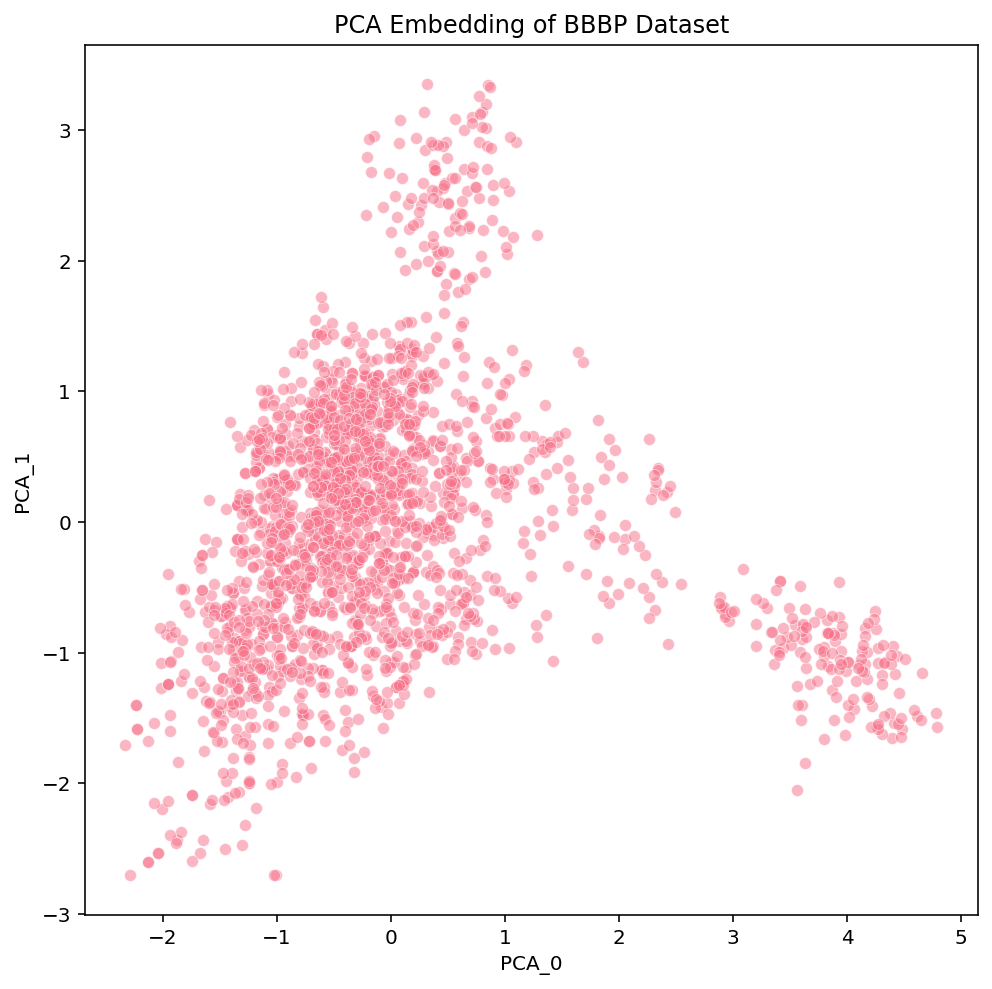
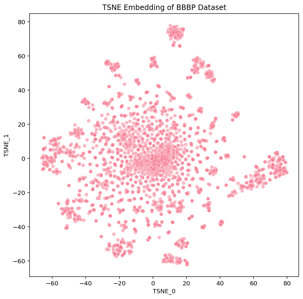
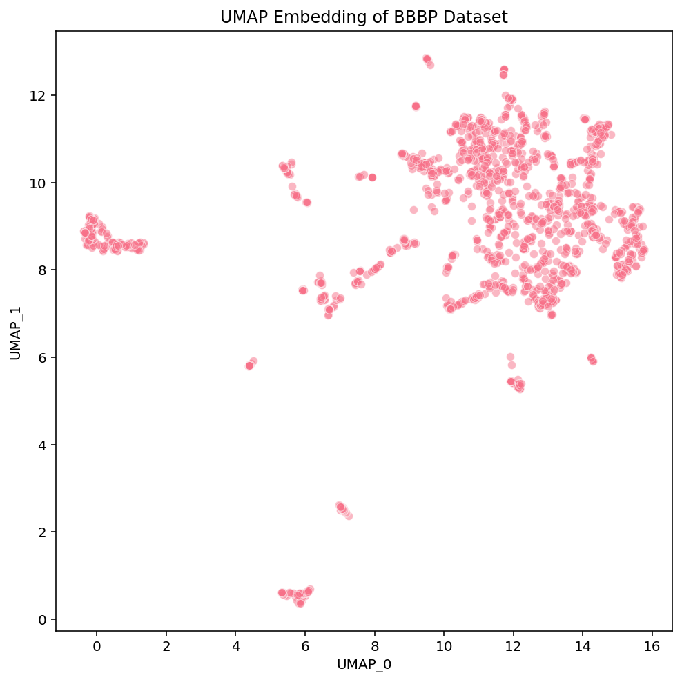
Click these links for interactive versions of the plots [PCA, t-SNE, UMAP]
At a first glance, we notice some high-level differences in the overall structures of the embeddings. PCA looks like the intersection of two orthogonal lines, and the compounds within them are somewhat uniformly distributed. t-SNE has a flowery shape that resembles a 2D gaussian, with a variety of isolated clusters around the edges. UMAP has many disjoint, tight clusters that do not follow a specific pattern. Beyond surface-level observations, we cannot ascertain much more about these embeddings from these plots alone. To do that, we need to look more into the actual compounds that are represented in these images.
These links [PCA, t-SNE, UMAP] take you to pages with interactive views of these plots, which is how we typically examine our datasets. Exploring the data in an interactive form helps builds intuition for how the different algorithms organize the chemical space of the dataset. To help guide this interactive exploration, we’ve selected a few clusters from the UMAP plot and highlighted where each of their compounds are embedded in t-SNE and PCA:
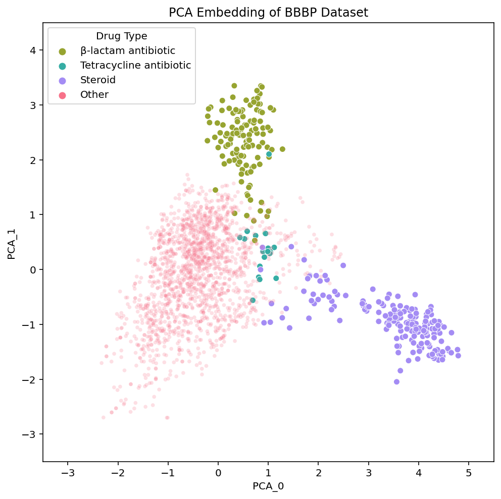
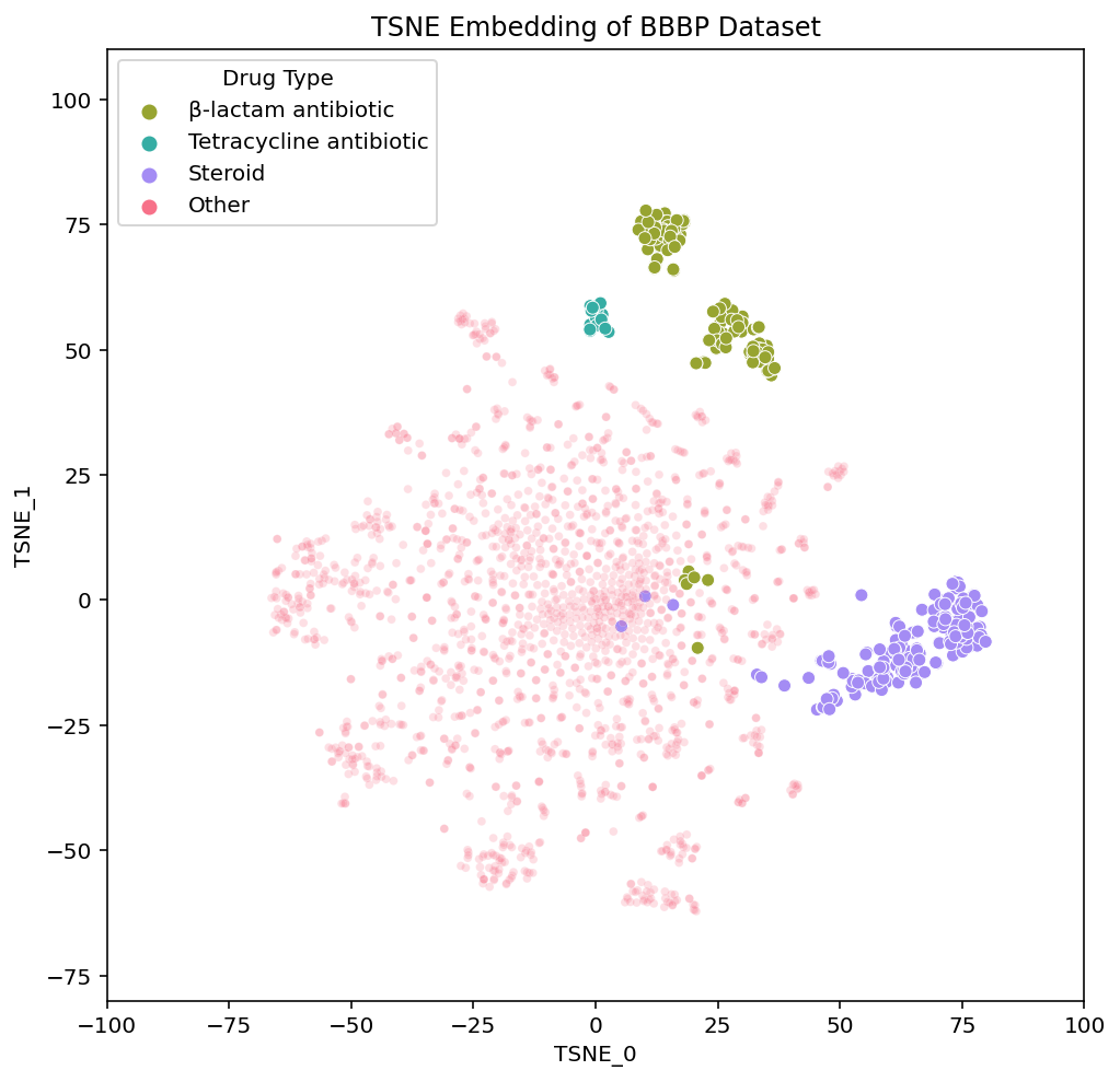
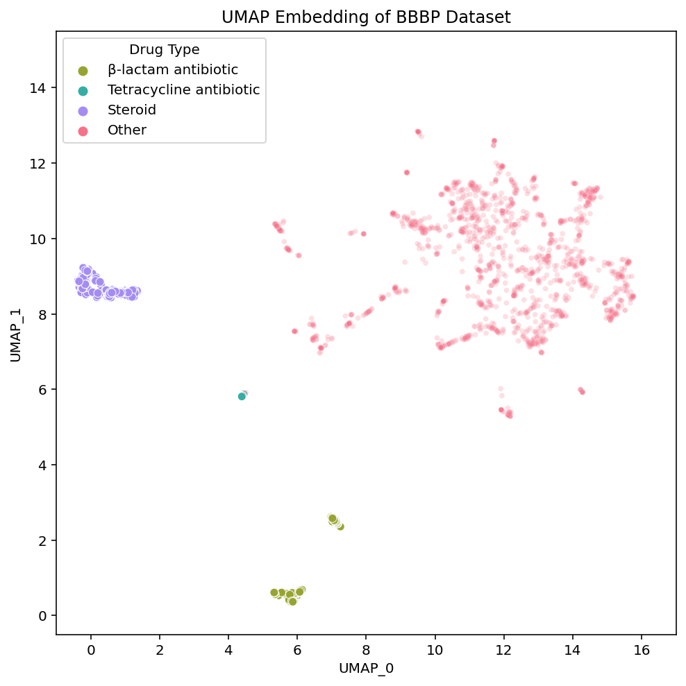
We see that local areas of the embedding contain compounds that not only look similar, but also belong to the same drug class. The clusters we’ve selected here contain steroids, tetracycline antibiotics and β-lactam antibiotics. Diving into the details of these clusters and their respective drug types serves as a great case study through which we can better understand and compare the structure of the embeddings.
Case study
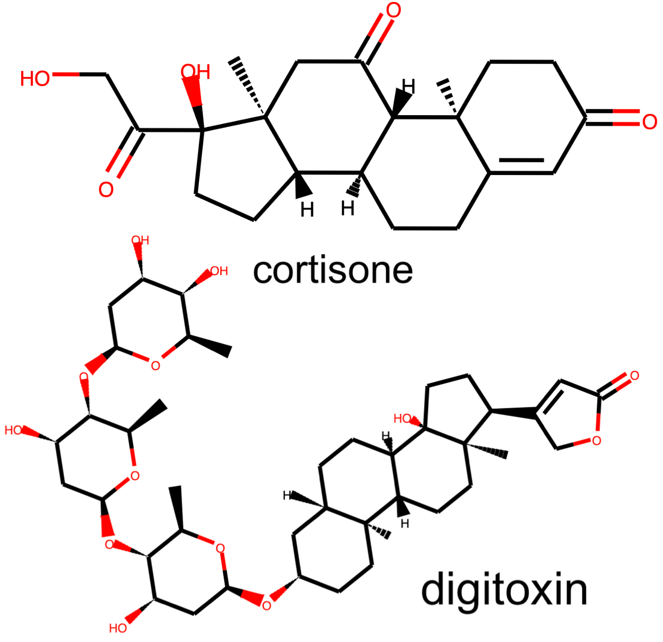
In the steroid cluster there are many compounds with the 4-ring system that is characteristic of steroids, and even some non-steroid compounds with a similar structure. Each method separates these compounds out from the rest, although UMAP appears to isolate them out and group them together the most strongly.
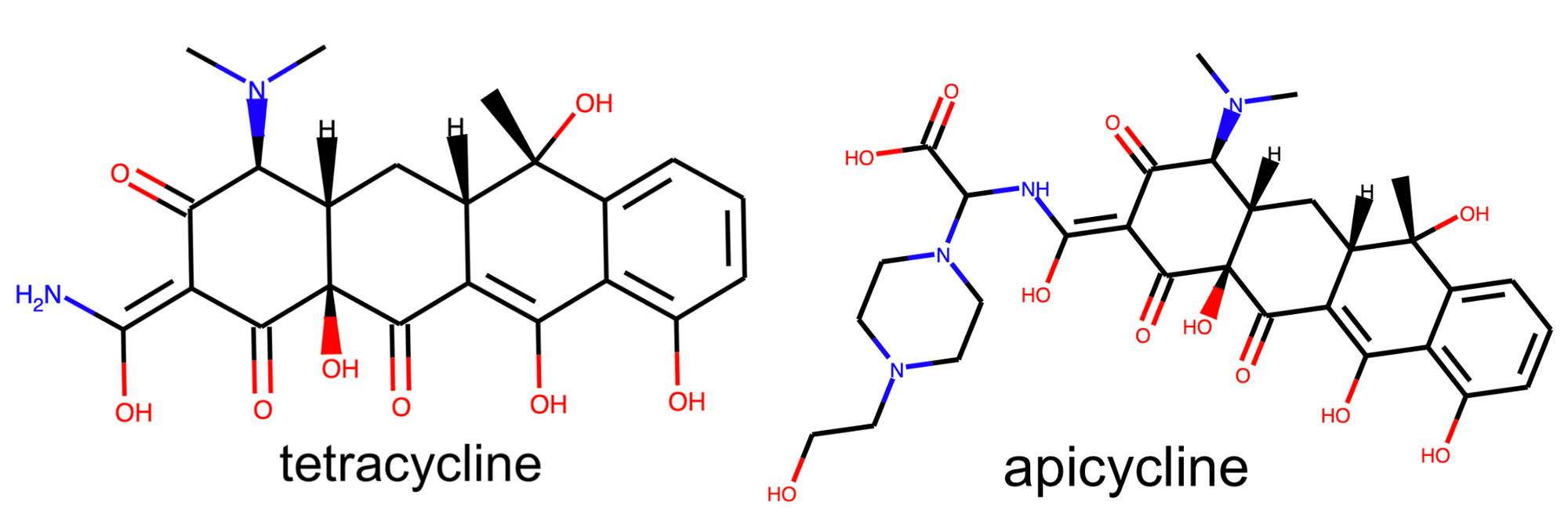
In a nearby but fully isolated cluster we find a collection of tetracycline antibiotics antibiotics. These compounds also contain a fused 4-ring system, however the tetracycline rings differ from the steroid rings due to their shape, relative positioning, and bond orders.
Comparing the embedding of the steroid and tetracycline clusters we see: 1) Steroids appear more isolated than the tetracyclines. If we assume the global distances between clusters are meaningful, this implies that the steroids are more unique from the rest of the dataset than the tetracycline are. 2) While the steroid compounds are spread out within their cluster, the tetracyclines are all embedded practically on top of each other. If we assume the spread of a cluster reflects the local diversity, this implies that the steroids are more diverse than the tetracyclines. 3) The two clusters are relatively near each other. If we assume the relationships between clusters are meaningful, this implies that these clusters are more similar to each-other than they are to the rest of the dataset.
To evaluate whether these assumptions about the global and local structure are true, we can examine the validity of the claims they imply. Should steroids be placed farther away from the rest of the compounds than the tetracyclines are? Both groups appear to stand out from the rest of the dataset, but it is difficult to manually compare their levels of uniqueness. Should tetracyclines and steroids actually be placed near each other? Given that both groups contain 4-fused ring systems, it seems reasonable for them to be located near each other but this similarity could just be superficial. To more quantitatively address these questions we look at the measured similarities between steroids, tetracyclines, and the rest of the compounds in the dataset. For each steroid compound, we calculate its average similarity to the other steroids, the tetracyclines, and every other compound. This is repeated with the tetracyclines. We define chemical similarity between compounds using Tanimoto similarity between ECFPs for the compounds, the same metric used to create the embeddings. The higher the Tanimoto similarity, the more similar to compounds are to one another.
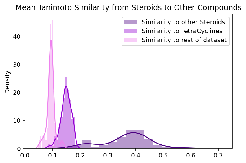
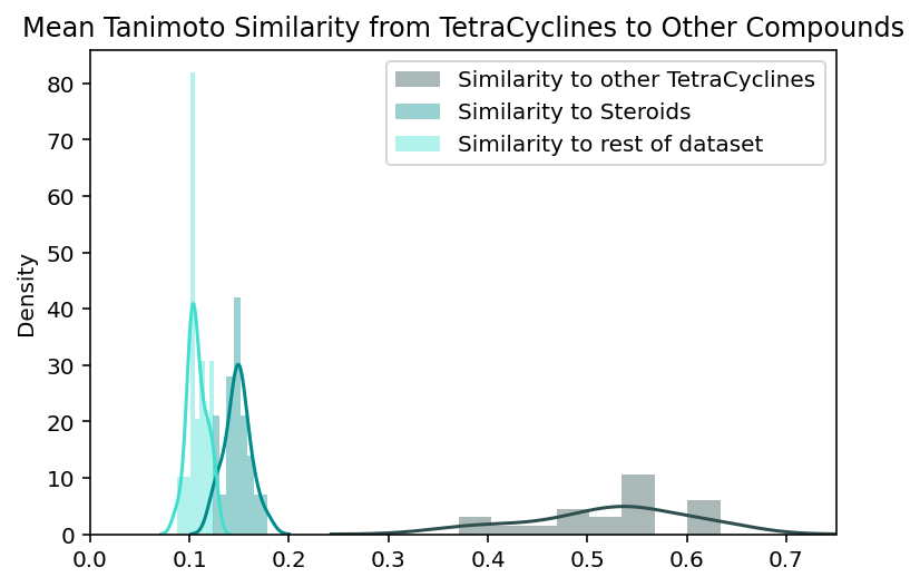
These plots contextualize some of our observations about the steroid and tetracycline clusters:
-
The steroids and tetracyclines have roughly equivalent levels of similarity to the rest of the dataset (average similarity of 0.09 and 0.1 respectively). The distributions are not identical but their difference is not large enough to explain the extra isolation of the steroid cluster. This supports the general belief that these global distances are not always interpretable.
-
Tetracyclines are indeed more homogenous than steroids. Tetracyclines have, on average 0.15 higher tanimoto similarity with other tetracyclines than steroids do with other steroids. This means that the spread of intra-group distributions actually reflect the local chemical diversity and are not just a strange quirk of the UMAP embedding.
-
Tetracyclines and steroids have higher similarity to each other than they do to the rest of the dataset. This means that the visual relationship between these embedded clusters actually reflects a real relationship between the compounds that the clusters represent.
This reveals that the global structure of this dataset is not maintained through exact distances between groups of compounds, but rather the relationships between them. Local structure is expressed by maintaining the local diversity of groups through their intra-group distribution. There actually is an even more detailed level of local structure hidden in these embeddings that we’ll examine later, but given the information we have so far these are the main conclusions. The embedding of two groups of compounds does not prove anything about UMAP that we expect to hold up for all embeddings. But their examples highlight important patterns in how chemical datasets get embedded.
We can compare UMAP’s arrangement of the steroids and tetracyclines with PCA and t-SNE’s to look for differences in the local and global structures of these embeddings:
| Global Structure | Local Structure | ||||
|---|---|---|---|---|---|
| Clusters Identifiable | Relationship between groups | Intra-group distribution | |||
| Steroids | Tetracyclines | Steroids | Tetracyclines | ||
| PCA | yes | no | nearby | disperse | disperse |
| t-SNE | yes | yes | far apart | disperse | tight |
| UMAP | yes | yes | nearby | disperse | tight |
Based on these observations, PCA is not as successful at maintaining the structure of these groups within the dataset. Specifically, t-SNE and UMAP highlight the uniqueness and homogeneity of tetracyclines, whereas PCA spreads the tetracyclines out amidst various other scaffolds in an unidentifiable way. This again supports that, although PCA maintains a few key elements of the global structure, t-SNE and UMAP preserve the global and local structure more consistently throughout the dataset.
Differences between the embeddings are less noticeable when examining the steroids Each method embeds the steroids in a clearly identifiable, yet disperse cluster. UMAP’s steroid cluster is the most isolated but as discussed earlier, this extra separation is not particularly meaningful. Both PCA and UMAP place the chemically similar steroids and tetracyclines nearby each other while t-SNE does not. This seemingly implies t-SNE’s global structure is not as informative. However, t-SNE places the tetracyclines near the β-lactam antibiotics, which, as we will read below, actually makes sense.
The differences between the methods are most apparent when we examine the β-lactam antibiotics. We see the namesake β-lactam ring present in every compound and, in terms of global structure, all three methods separate out the β-lactam antibiotic compounds as significantly unique from the rest. Again, the placement in PCA is not as isolated as it is in the other methods but the cluster still stands out.
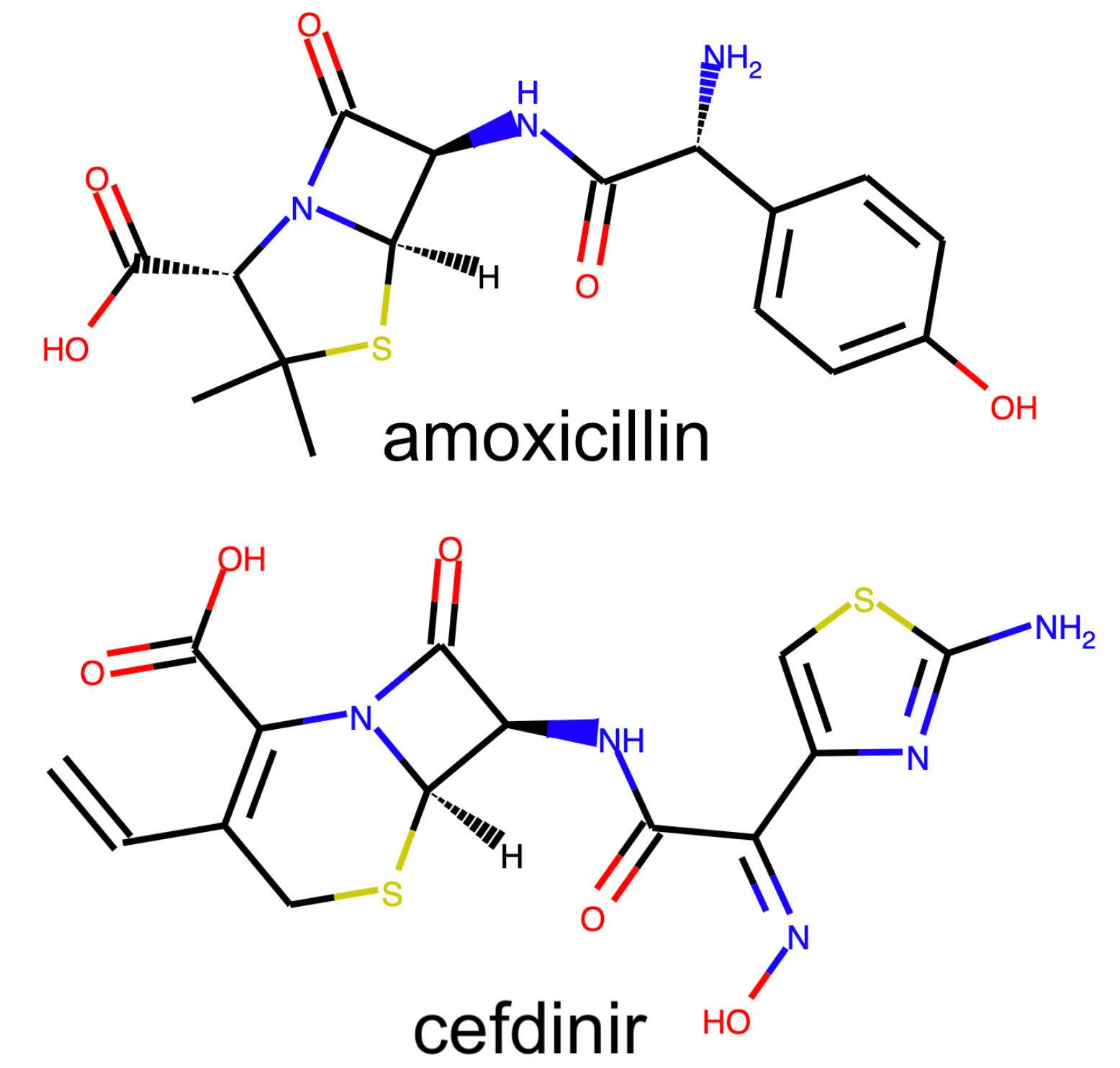
The β-lactam antibiotics are interesting because they give us a view into the level of local organization that t-SNE and UMAP have within the subclasses of this drug-type:
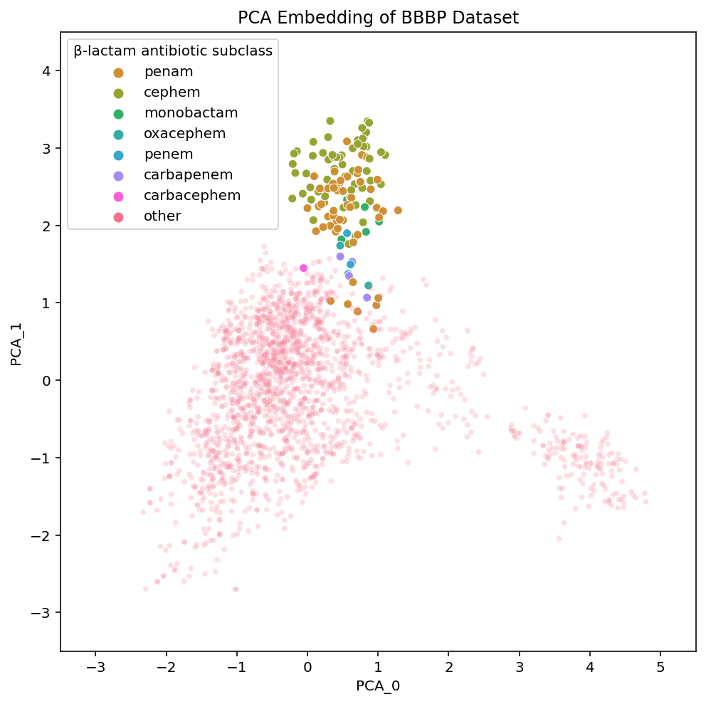
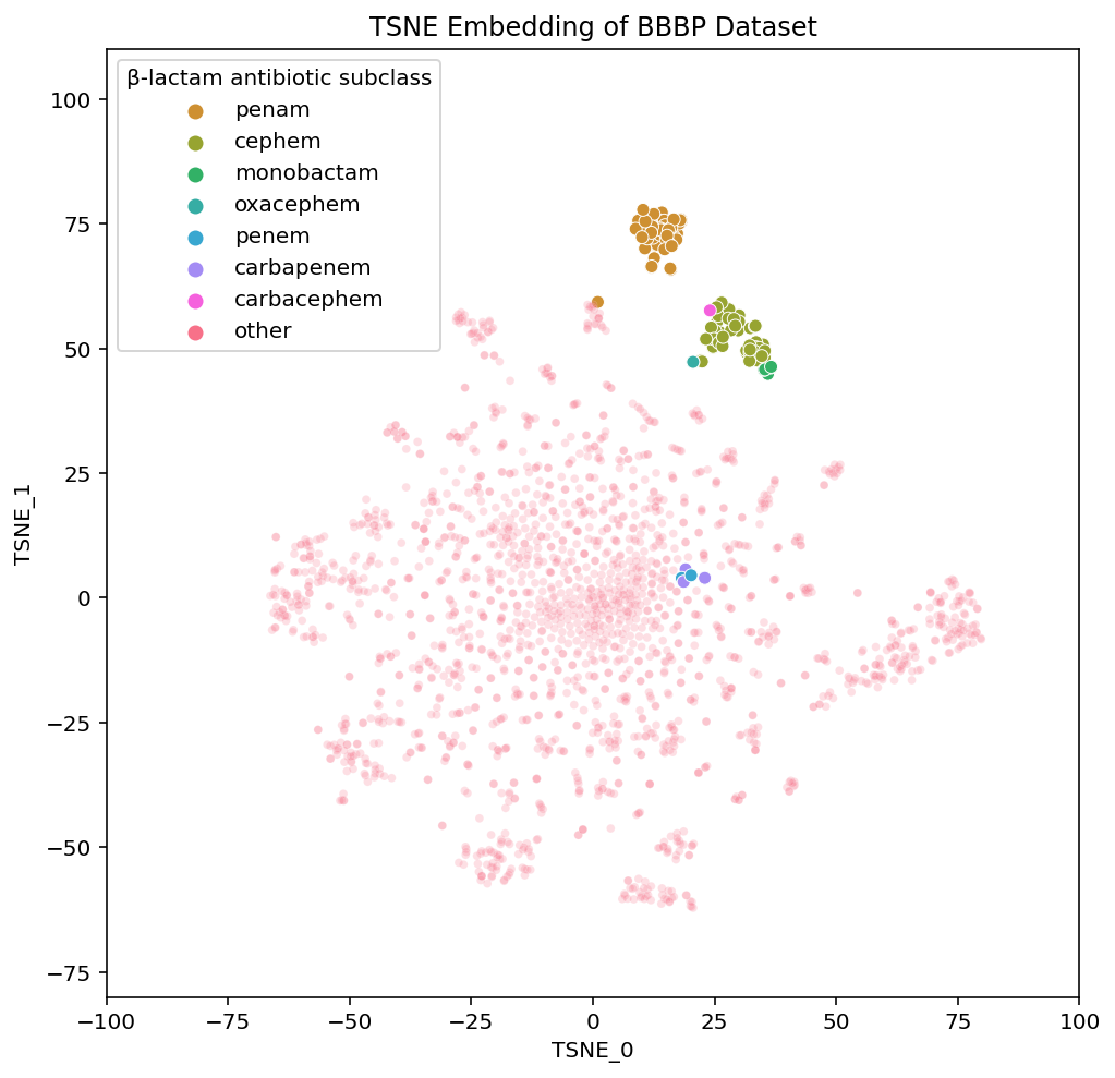
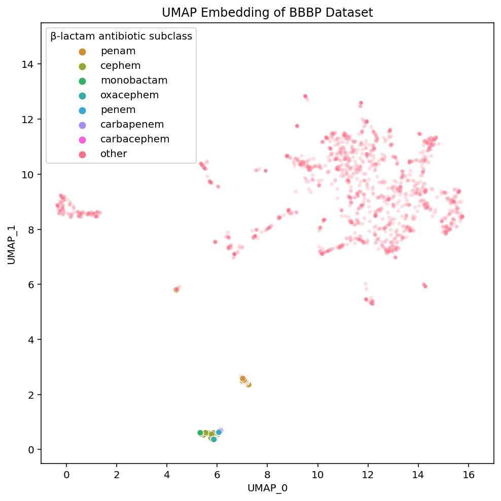
We have labelled each of the various subclasses of β-lactam antibiotics. They vary based on the particular details of the β-lactam ring system in a given compound. You don’t need to actually understand the differences between the various β-lactam subclasses but know they are fairly small. The importance of visualizing them is to highlight their placements in each of the embeddings.
PCA has all of the subtypes mixed together, which makes sense given that in PCA, the principal components we are visualizing are meant to have maximal variance. The nuances within a class of drugs are not particularly high variance so a 2-D PCA plot loses this local structure. On the other hand, t-SNE and UMAP both maintain local structures in the dataset by embedding the β-lactam antibiotics in a way that separates the compounds based on their subclass.
Zooming into the bottom of our UMAP plot where the β-lactam compounds are embedded, we can better examine the details of each subclass:
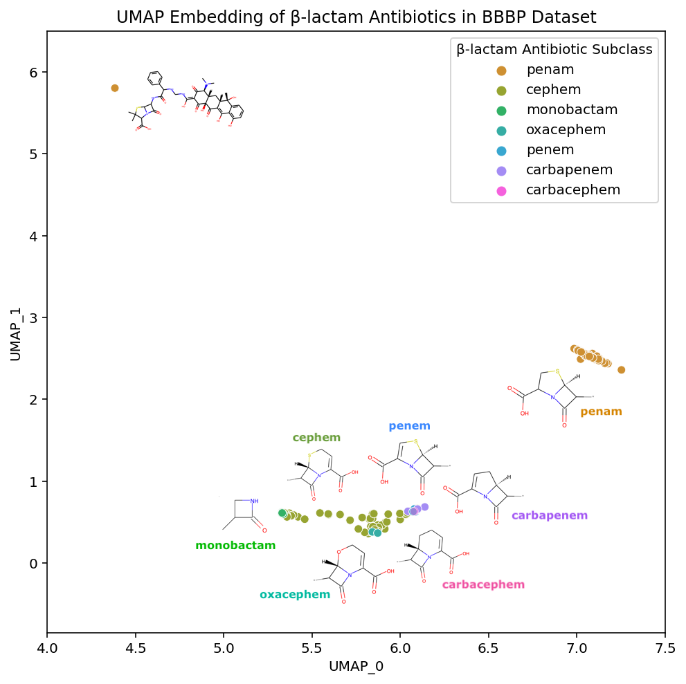
Not only are the β-lactam antibiotics contained in this section of the UMAP embedding, but the individual subclasses are each grouped together. If we look at the interactive versions of the plots (PCA, TSNE, UMAP), we see a similar phenomena in the t-SNE embedding. This ability to maintain both global structure and such specificity in the local structure is what makes these methods useful for easily exploring a dataset.
If we look even closer at the placement of the β-lactam antibiotics, we discover a fascinating property of our embedding. In the annotated plot above there are two main clusters of β-lactam antibiotics and one outlier compound, in the upper left corner, that has the substructure of a Penicillin (penam), yet appears to be located far away; in fact, it is placed in the tetracycline cluster.
The tetracycline antibiotics are structurally quite different from the β-lactam antibiotics, and yet they are embedded relatively nearby in both UMAP and t-SNE. We do not expect the distances between clusters to necessarily mean anything, but in this case, their relative positioning actually does.
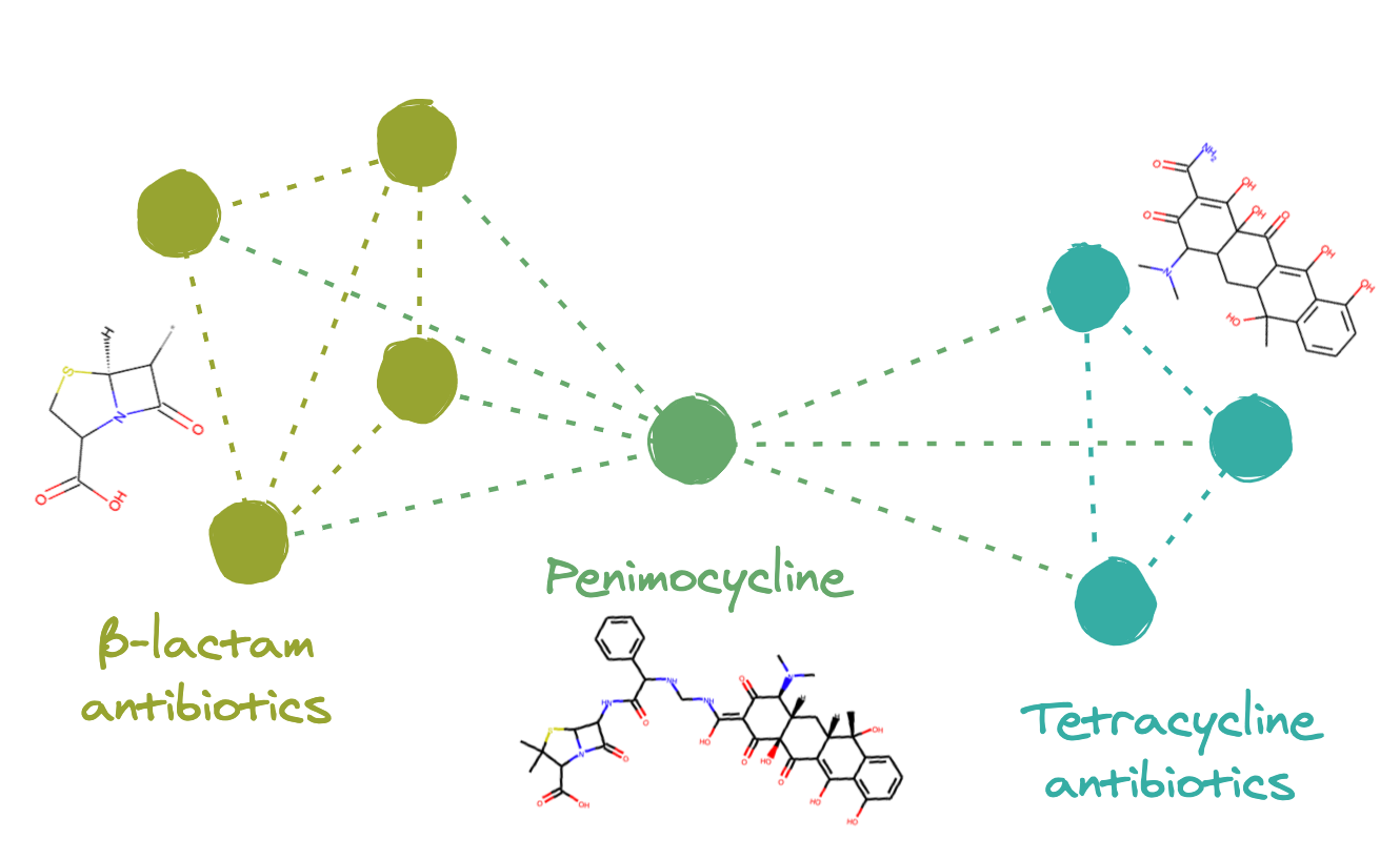
The outlier compound, Penimocycline, contains both the substructure of the Penicillins (penam) and the substructure of the Tetracycline. It is actually classified as both types of antibiotics. When constructing a graph representation of this dataset, this compound is likely connected to both of these two well-connected subgraphs. This would link the two groups together, ultimately leading to their respective clusters of compounds being located near each-other in the final embedding.
To investigate this assumption, we can remove Penimocycline from our dataset and generate a new embedding. If this compound is functioning as a link between the tetracycline antibiotics and β-lactam antibiotics, embedding the dataset without it would break the connection between the groups and their positions would no longer be close to each other.
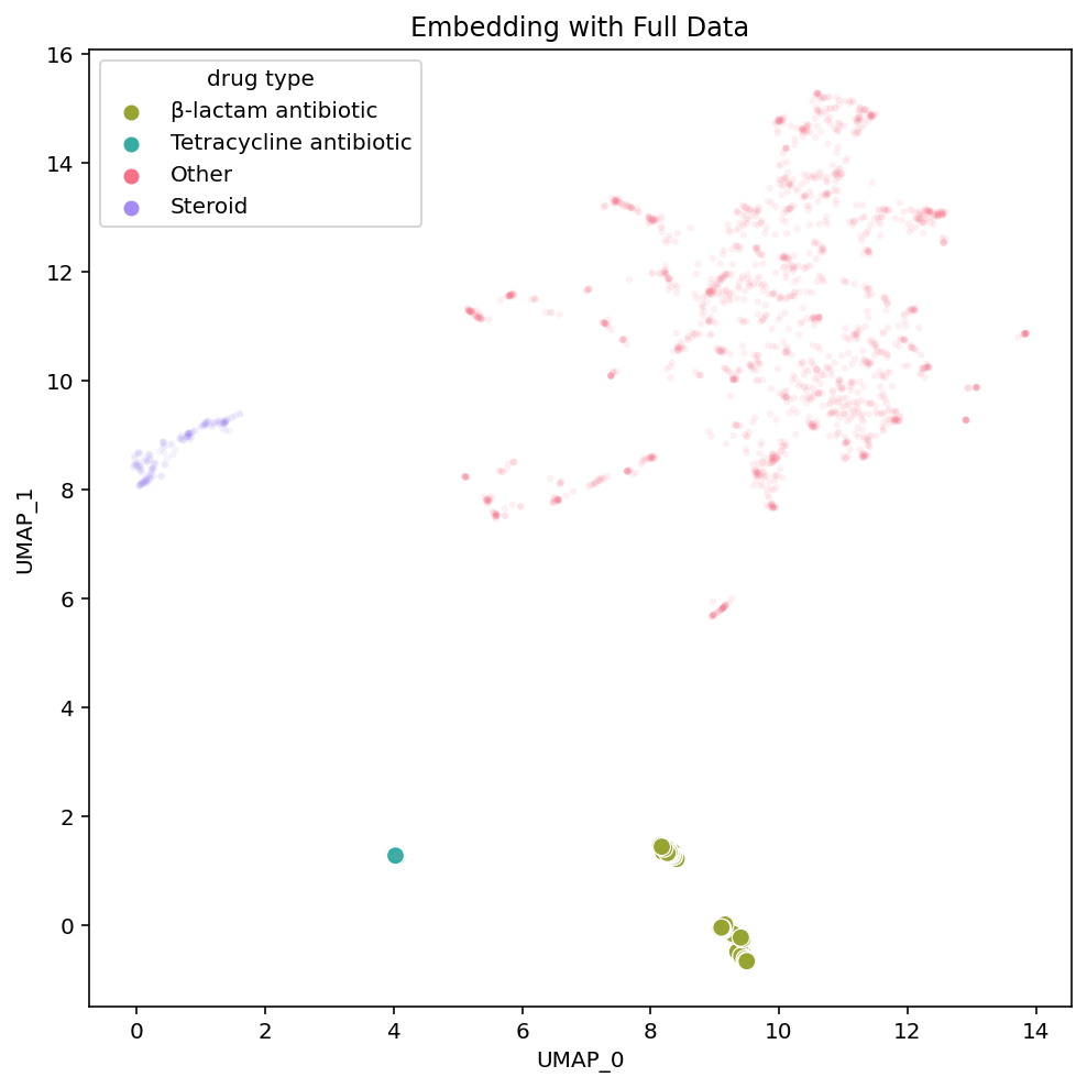
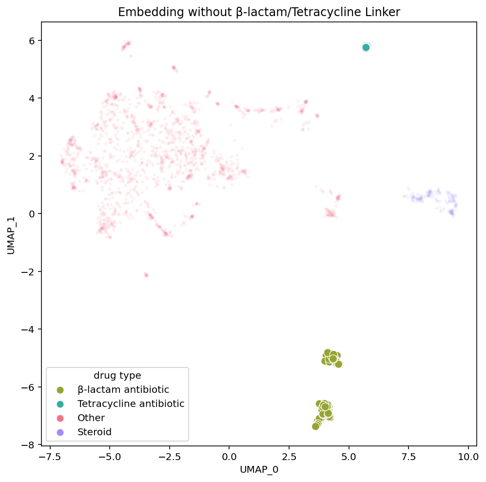
As hypothesized, in the new embedding on the right, we see that the tetracycline antibiotics are no longer placed near the β-lactam antibiotics. Tetracycline antibiotics are still near the steroids in each embedding variant, yet the induced separation between the tetracycline and β-lactam antibiotics has shifted much of the embedding. UMAP is non-deterministic so we re-ran these embeddings (both the original on the left and the modified dataset on the right) multiple times and this phenomena held up. This implies that the single compound actually is the influential node linking the β-lactam and tetracycline antibiotic clusters. It also reveals how the structure of UMAP is greatly influenced by individual compounds with strong connections between otherwise disconnected subgraphs of the dataset.
If you continue exploring the other areas of this dataset in the interactive links or Colab notebook provided you will also find collections of narcotics, sedatives, NSAIDs etc. Examining where specific compounds get placed in each of the embeddings helps explain the structural differences between the embeddings.
Hyperparameters
UMAP has several hyperparameters that give the user a bit more control over the structure of the final embedding based on their particular priorities:
-
n_componentsis the dimensionality of the final embedding. To create visualizations in 2 dimensions we keep this fixed at 2 components. -
metricis the metric used to determine distance between points. Because we are comparing ECFPs, we use Jaccard distance (typically referred to as Tanimoto distance in cheminformatics). -
n_neighborsdetermines the prioritization of local versus global structure in the embedding. This value constrains the number of neighbors that a given compound has in the graph representation of the dataset. If n_neighbors is small then the embedding focuses on optimizing the distances between similar compounds to ensure the small differences between them are well represented. If n_neighbors is larger, then the distances between less similar compounds is prioritized. -
min_distis the minimum distance between any two points. This affects the tightness of the embedding. The larger min_dist, the more spread out the compounds will be.
n_neighbors and min_dist can be tuned based on the dataset’s properties and the user’s preferences. The ideal settings may vary based on the dataset. These plots show how varying n_neighbors (along the rows) and min_dist (along the columns) can influence the embedding:
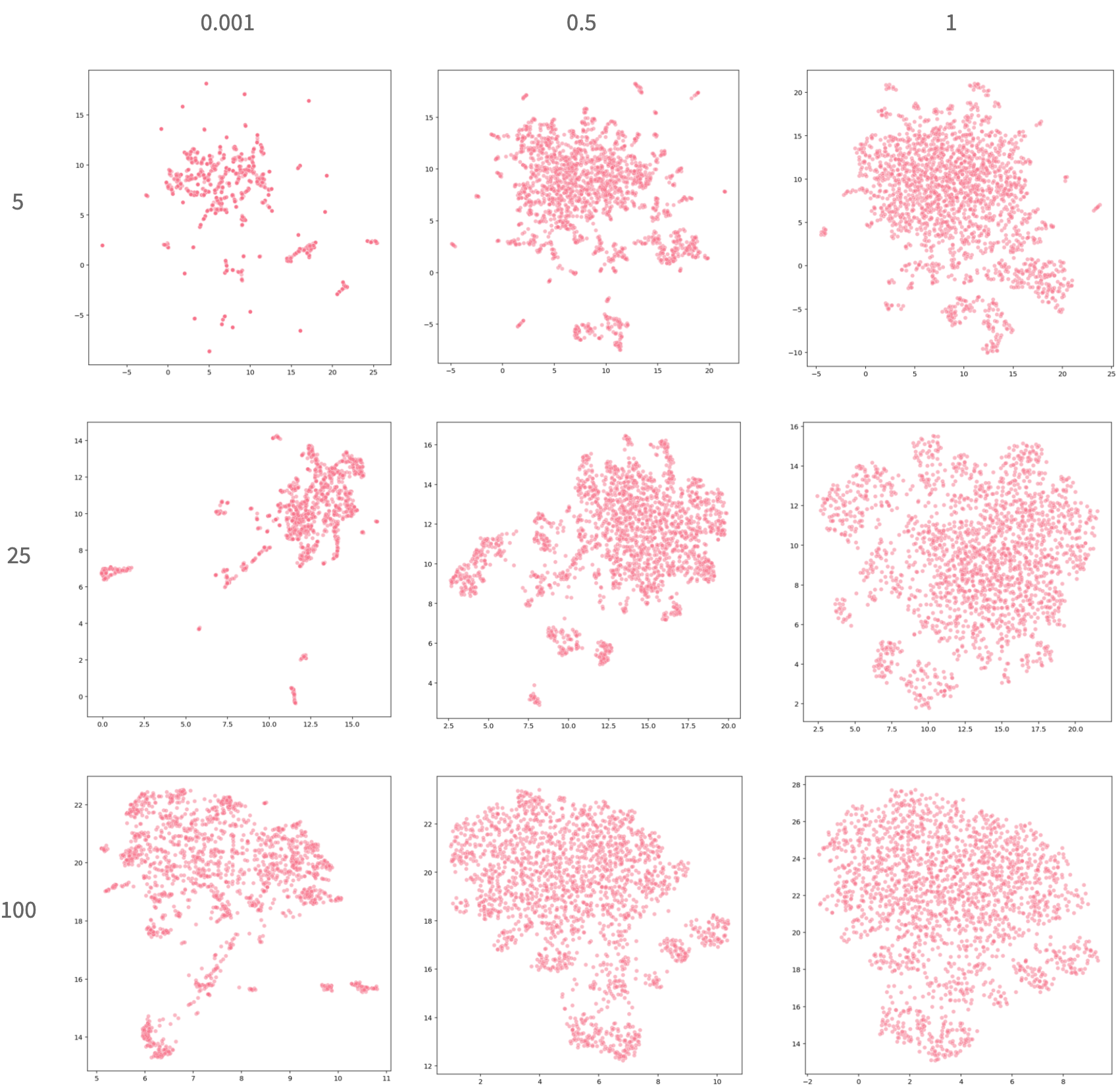
As these plots reveal, the spread of the embedding is quite dependent on the relationship between these two parameters. When min_dist is very small, compounds that are very similar to each-other are placed almost directly on top of each other, which makes it very easy to identify unique clusters. However, it is more difficult to decipher the actual quantity of compounds and the nuanced differences between them. When min_dist is large, it is easier to gauge the full spread of the compounds but more difficult to isolate specific clusters. When n_neighbors is small there are meaningful patterns within clusters but the global structure is less interpretable. As this value increases we see the relationships between the clusters becoming more noticeable as the clusters become less sparse. As with the t-SNE / UMAP comparison, there is no clear answer that one particular set of hyperparameters is always best. Depending on what the user is looking for, there are many great options.
Other Works
For a non-comprehensive list of examples of others using UMAP for chemistry and biology purposes see:
- Dimensionality reduction by UMAP to visualize physical and genetic interactions
- Wicked Fast Cheminformatics with NVIDIA
- One class classification as a practical approach for accelerating π–π co-crystal discovery
- Generative molecular design in low data regimes
- Focus Your Screening Library: Rapid Identification of Novel PDE2 Inhibitors with in silico Driven Library Prioritization and MicroScale Thermophoresis
- UMAP Visualization of SARS-CoV-2 Data in ChEMBL
- De novo design and Bioactivity Prediction of SARS-CoV-2 Main Protease Inhibitors using ULMFit
This year yet another alternative to t-SNE, TMAP has been developed. We haven’t extensively investigated that method yet, but it does seem promising.
Caveat
It is impossible to distill all of the complexities of chemical space into 2-dimensions and a lot of information gets lost in the process. Our low-dimensional embeddings can only be as good as their high-dimensional predecessors, the ECFPs. ECFPs are an imperfect, yet important, method for vectorizing molecules and using the distances between these sparse vectors as the basis for generating the underlying UMAP graphs means that our embeddings can only be as good as those distance metrics. Despite these flaws, we still find these plots to provide significant value to our design efforts.
Practical Uses for UMAP at Reverie Labs
We use UMAP in two main ways when examining a dataset:
- Dataset Specific Embeddings: Examine the particular distribution of compounds within a specific dataset
- Dataset-Agnostic Embeddings: Examine where the compounds of a dataset fit into our general embedding of global chemical space
We can also use these two embeddings as new lenses to view the distribution of measured properties and other physicochemical properties.
Dataset Specific Embeddings
To create a dataset-specific embedding, we fit a UMAP model on the molecules of the particular dataset we are investigating. All of the visualizations we have used so far are based on dataset-specific embeddings of our example BBBP dataset. As we saw when examining the local and global structure of the UMAP embedding, a dataset-specific plot provides a good understanding of the nuances within the dataset.
To add an extra dimension, we can color the plots based on any other relevant data we have on the compounds. Earlier we did this using the drug-types of certain compounds, but we can just as easily visualize the compounds colored by the date-of-synthesis, the measured property (in our case blood brain barrier permeability), physicochemical properties, or the dataset-split.
This can help answer questions such as: Are there clusters of compounds that have not been actively developed in years? Are all of the most potent compounds in one area of chemical space? If splitting the dataset for model training and evaluation, do certain splitting methods lead to any particular artifacts?
Measured Properties
| Here we color the points on the plot by the measured property of our dataset: whether the compounds can permeate the blood brain barrier or not. Many of the areas in this space contain exclusively permeable or exclusively impermeable compounds. This reveals that, within this dataset, there are certain types of compounds that are consistently permeable or not and the general scaffold of the compound is sufficient to determine the permeability of many compounds. | 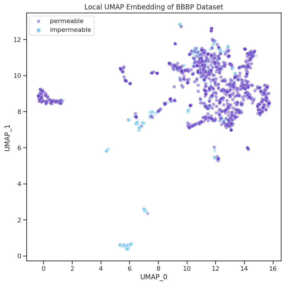 |
If we were to use machine learning to model this dataset, we might want to ensure that individual homogeneously-labeled scaffolds are not split between the training and test sets as that could misleadingly inflate performance metrics.
Physicochemical properties
| Using Molecular Weight as our example physicochemical property, we observe that UMAP groups the heaviest compounds all together as part of one cluster, which contains many large macrocyclic compounds that are all impermeable. | 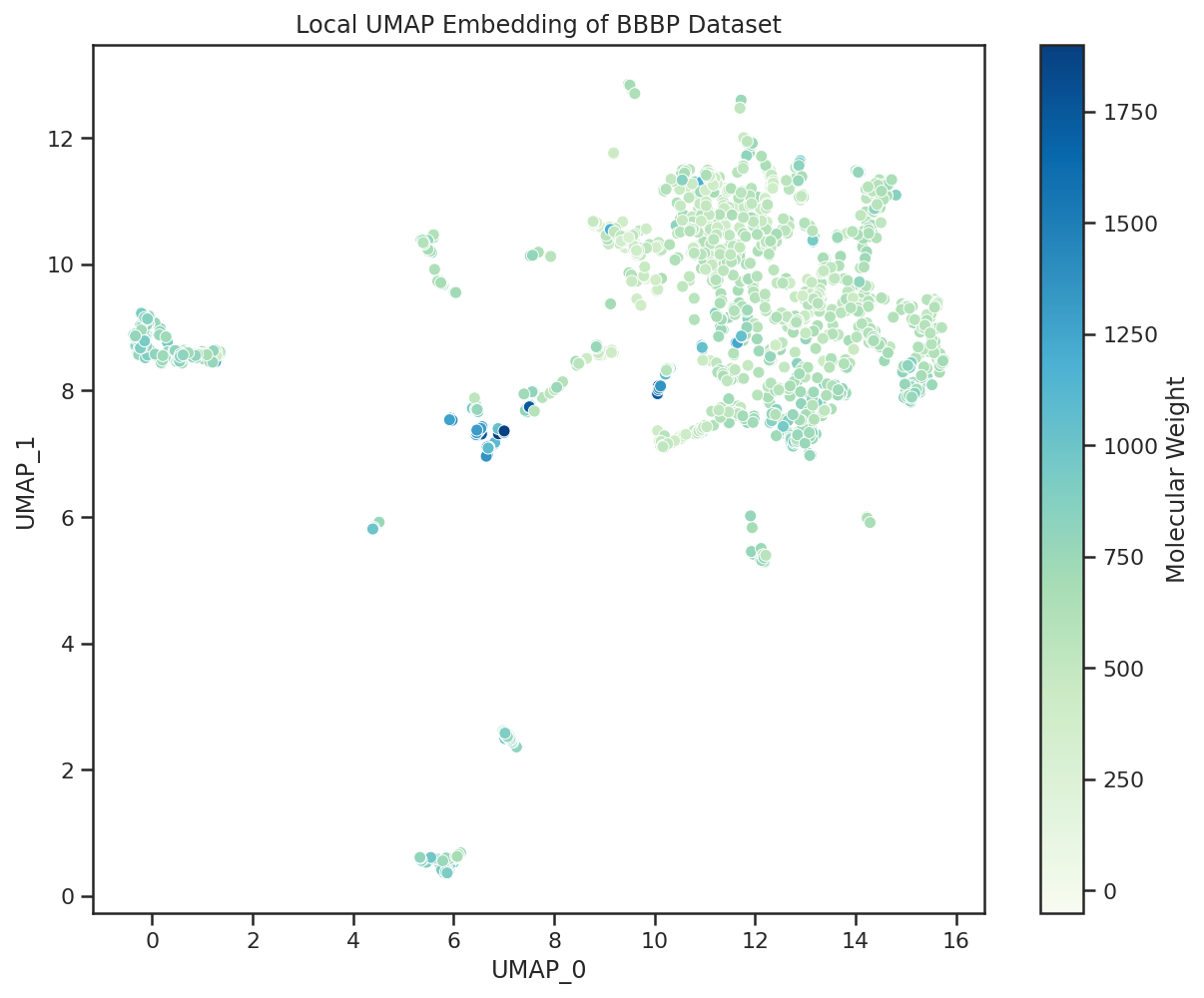 |
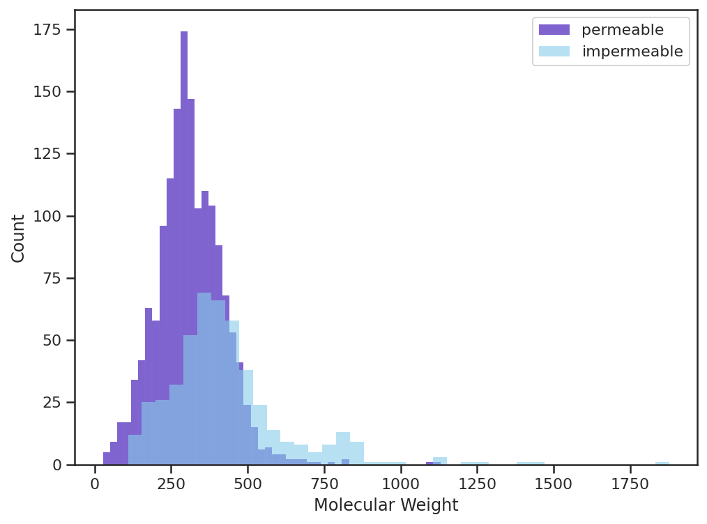 | Visualizing the Molecular Weight (MW) of the permeable/impermeable compounds we see a similar phenomena in which the majority of the heavy compounds (MW > 500) are impermeable. This aligns with traditional assumptions that compounds heavier than 500 Da will struggle to permeate the blood brain barrier. |
The UMAP plot is useful in quickly identifying where the compounds of a given molecular weight lie, what is the diversity of molecular weight within given clusters, and how these properties interplay with blood brain barrier permeability.
Dataset-Agnostic Embeddings
To create a dataset-agnostic embedding, we take advantage of the way that UMAP treats fitting and transforming a dataset as two separate steps. We start by fitting a UMAP model on a large in-house corpus of drug-like compounds that we consider to be representative of ‘drug-like chemical space’. Now, when we want to examine a new dataset, we load up this cached model and use it to transform the compounds of our dataset into this universal embedding space. With Dataset Specific embeddings, the dimensionality reduction method itself depends on the relationship between all the compounds in the dataset we seek to visualize. With Dataset-Agnostic embeddings, the dimensionality reduction method is treated as fixed so the location of a given compound is agnostic to the other compounds in the dataset.
This allows us to examine multiple datasets all with a consistent frame of reference. We can visualize if the data is diverse and covers a wide area in this drug-like space or if it is contained to a few specific areas.
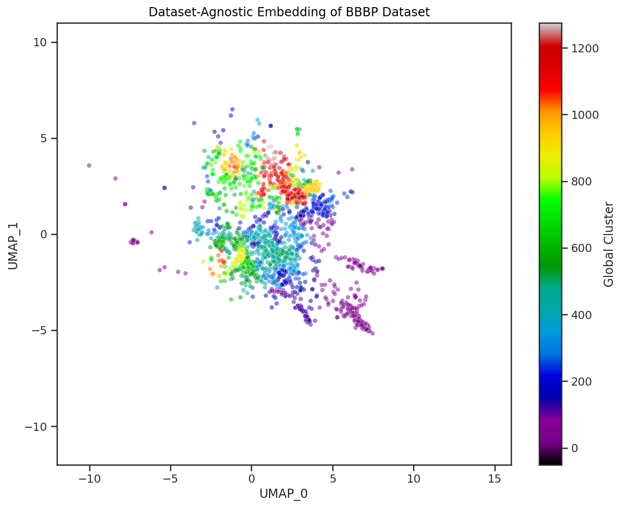
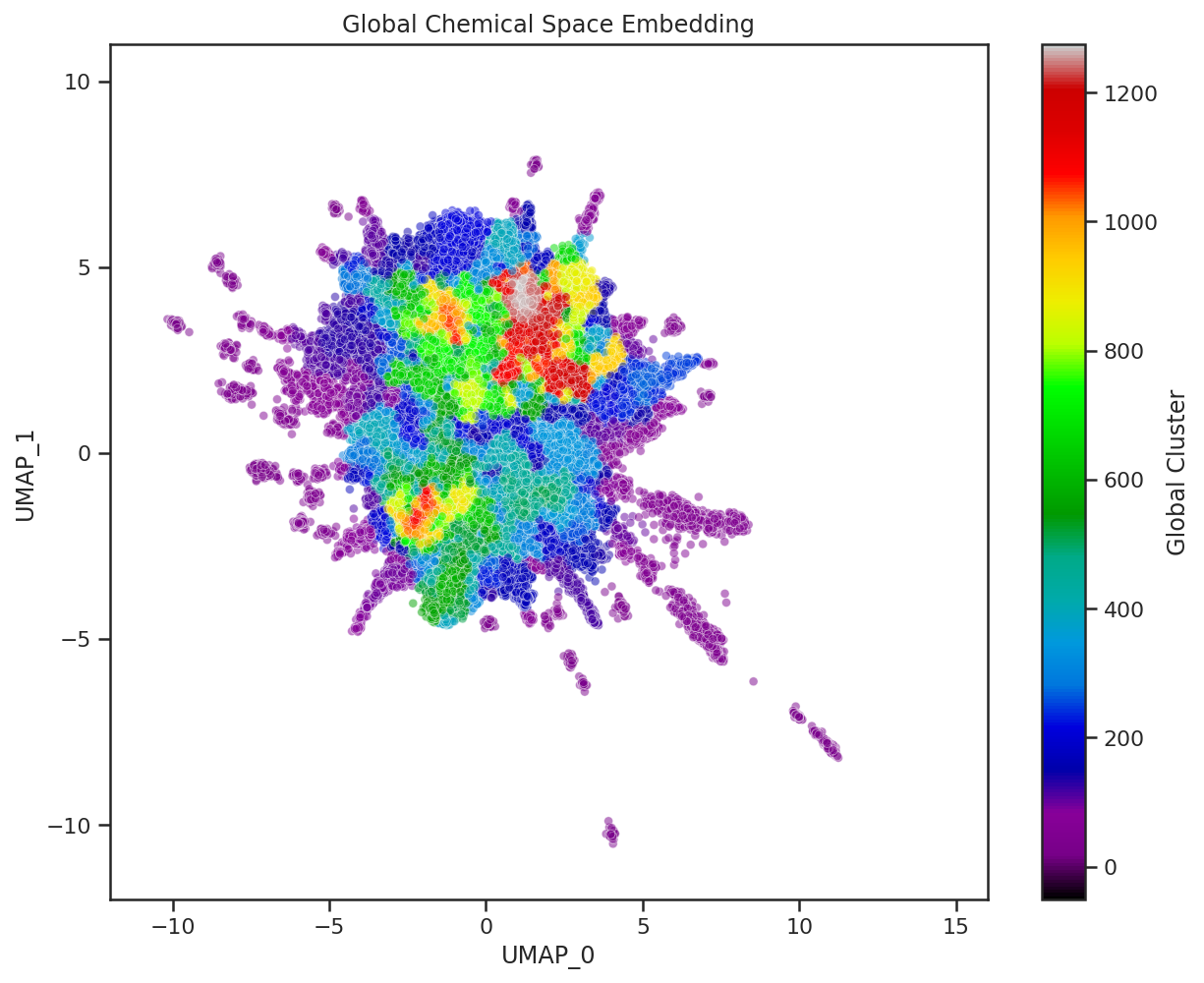
Here we visualize both the original embedding of our global chemical space compounds used to fit the general UMAP model, and a Dataset-Agnostic embedding of the BBBP dataset created with this fixed model. The compounds of each are colored by their cluster assignment in this embedded space. To get these cluster assignments we have pre-fit a clustering model on the original global chemical space compounds in their UMAP embedding. We then use this pre-trained clustering model on new datasets to quickly determine which of the global UMAP clusters our new compounds fit into. We can even calculate the percentage of global clusters covered by our new dataset to create a quick, quantitative heuristic of chemical space covered by the dataset.
As we saw in our case study, distances in UMAP space aren’t necessarily meaningful and global structure can be greatly influenced by individual compounds. Thus, clusters based off of these embedded distances should be interpreted with caution. However, they can definitely help with the visual examination of the dataset, and can establish a quick, quantitative approximation of chemical space coverage. When combining these cluster heuristics with the visuals of the global embedding, we can start to understand the diversity of a given chemical dataset.
Final Thoughts
UMAP is useful because it is easy and quick to create local and global embeddings. This allows us to treat this analysis as a standard piece of our internal pipeline for cleaning, analyzing, and preparing new datasets for analysis and machine learning. Overall UMAP seems to be a great alternative to the more popular methods for dataset embedding, and it would be exciting to see more examples of groups using it for chemical data.
This post highlighted UMAP’s value for exploring the chemical space of datasets relevant to drug design. The t-SNE vs. UMAP debate is still greatly contested, but we don’t aim to use this example to prove that UMAP is fundamentally better than t-SNE (although many have argued this, some have refuted it, and others have even refuted the refutation!) Similarly, even though PCA is less useful for our particular goals, PCA also has many advantages over its nonlinear alternatives that make it very useful for other purposes. Ultimately, there are many great dimensionality reduction tools to choose from, but we hope that this post has helped to put UMAP on your map.